There’s an app — I won’t name it — that takes your photo and makes it look like a watercolor in about two seconds. It costs nothing. The result looks like someone smeared Vaseline on your screen and added a sepia tone.
You can probably name three apps that do this. They’re everywhere. And people keep asking me how Nobly is different from those.
Fair question. Here’s the honest answer.
The face problem
The fundamental challenge of turning a photo into a painting is the face. Always the face.
If you apply a painterly effect uniformly across an entire image — which is what filters do — the face gets distorted along with everything else. Brushstroke textures cut across the eyes. Skin tones get muddy. The nose loses definition. The mouth blurs. And suddenly the portrait doesn’t look like the person anymore. It looks like *a* person, vaguely, in the style of an art student’s first oil painting assignment.
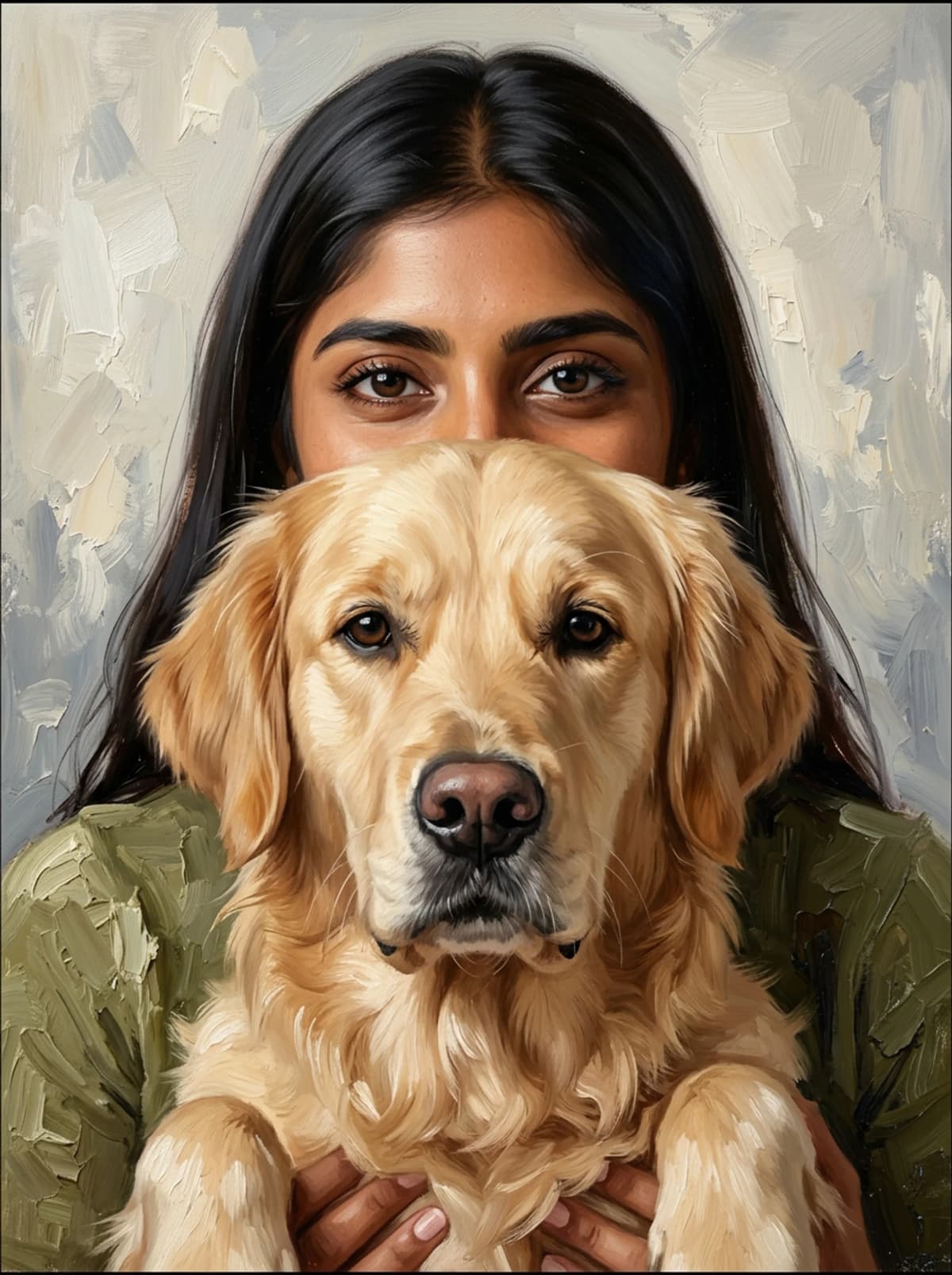
This is even worse with pets. A dog’s face is all about the specific set of their eyes, the exact shape of their muzzle, the pattern of their markings. Smear a filter across that and you get a generic dog-shaped blob with some color variation.
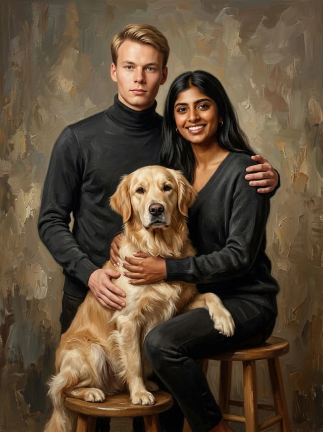
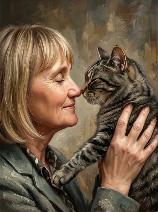
Nobly does something different. The faces — both the human face and the pet’s face — are rendered with high photorealistic detail. Sharp. Specific. *That’s* your dog, not *a* dog. *That’s* you, not some approximated version of you.
Everything else — the background, the clothing, the overall atmosphere, the composition — gets the full oil painting treatment. Loose brushstrokes, rich texture, that golden-hour light quality you see in Flemish portraiture. It’s painted in the way that actual portrait painters have worked for centuries: obsess over the face, be expressive with everything else.
Why this balance exists in real painting
This isn’t something we invented. It’s how oil portraiture has worked since — honestly, since before the Renaissance.
Look at a John Singer Sargent portrait sometime. The face is rendered with insane precision. Every plane of the cheekbone, every subtle shadow under the lower lip. Then look at the hands. Looser. Then look at the clothing. Even looser — bold strokes, visible brushwork, fabric suggested rather than described. Then look at the background. Sometimes it’s practically abstract.
Sargent knew what your eye cares about: the face. He spent 80% of his effort on 20% of the canvas. That’s not laziness. That’s understanding how human attention works.
Rembrandt did the same thing. So did Velázquez. So did basically every great portraitist. The face is the anchor. Everything else supports it.
When a photo filter applies the same level of distortion everywhere, it’s violating this principle. It’s treating the background with the same importance as the eyes. Your brain knows something is wrong even if you can’t articulate what.
What “AI art” usually means (and why it’s not this)
Most AI art generators give you one of two things: either a completely invented image that looks like no one in particular, or a cartoonish interpretation of your photo that exaggerates features and loses likeness. Some of them are fun. I’m not here to trash them. If you want your cat drawn as an anime character, great, there are tools for that.
But that’s a different thing than what we’re doing.
A Duo portrait is a *portrait* in the traditional sense. It’s meant to capture the actual appearance of a specific person and a specific animal. The painterly quality is the medium, not a gimmick. The same way an oil painter uses canvas and pigment as a medium to capture someone’s likeness, we use this rendering approach to create something that has the gravitas of a painted portrait but the accuracy of a photograph.
Nobody looks at a Sargent painting and says “cool filter.” And nobody should look at a Duo portrait and think that either.
The technical part (briefly, I promise)
Without getting deep into the weeds — and honestly, some of this is proprietary so I can’t get too specific — the process involves generating the portrait at high resolution with different treatment for different zones of the image. Face zones get one approach. Body and background zones get another. The transition between them has to be seamless, which is harder than it sounds. If the face is hyper-sharp and the rest is suddenly blurry, it looks like a bad Photoshop composite. The gradient of detail has to feel natural.
We also work in a specific color space that mimics the way oil paint reflects light. Real oil paint has a luminosity to it — the pigment sits on top of the canvas in a way that creates depth. Digital art tends to look flat unless you specifically work against that. The warm earthy palette we use isn’t just an aesthetic choice; those ochres and ambers and deep browns are the colors that respond best to this approach. They have warmth and depth baked in.
The output is 4K, which matters more than people realize. At lower resolutions, painterly details turn to mush. At 4K, you can see individual brushstroke direction. When that gets printed on canvas, especially at larger sizes — the texture of the canvas weave combined with the visible brushwork in the image — it genuinely looks like a physical painting.
The accessibility question
I know what you’re thinking. If this is so sophisticated, how is it affordable? Isn’t good art expensive?
Traditional commissioned oil portraits cost hundreds or thousands of euros. They take weeks. A human painter is mixing pigment, standing at an easel, probably swearing. That has value and I respect it deeply.
What we’ve done is found a way to achieve a result that — honestly — most people can’t distinguish from traditional portraiture at normal viewing distance, and make it accessible. You don’t need to spend what you’d pay a portrait painter to get something that looks stunning on your wall.
Is it exactly the same as a hand-painted portrait? No. A real oil painting has physical texture — ridges of paint, visible impasto, that thing where the light catches a thick brushstroke differently depending on where you’re standing. We can mimic that effect on canvas, and it’s convincing, but it’s not the same.
I’d rather be honest about that than pretend we’re something we’re not. What we are is really, really good at making portraits that look and feel like oil paintings, that capture the specific likeness of you and your pet, and that arrive at your door ready to hang. For the vast majority of people, that’s more than enough.
And it takes 30 seconds to preview at getnobly.com. Free. So you can just see for yourself.